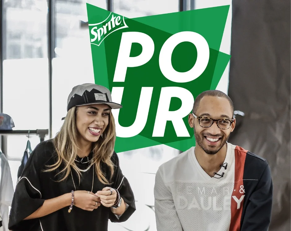
Sprite and our team developed their influencer program Sprite P.O.U.R. to highlight the movers and shakers of the art, music and fashion arenas in popular urban cities. In its origins, the brand was a direct reflection of Sprite and its corporate and consumer branding, but after several years of success, we decided it was time for its aesthetics to come into its own. Below is the redesign of its logo and marketing and collateral assets to be use in the digital and social space, as well as live activations.
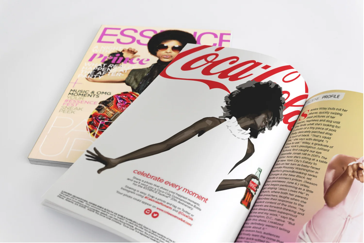
In our third year in working with the annual ESSENCE Festival, we were tasked to create a print ad to be featured in the June issue of ESSENCE™ Magazine. The goal of the ad was to encourage readers to participate in our UGC (user generated content) campaign, sharing their photos of the festival and pre-festival activities.
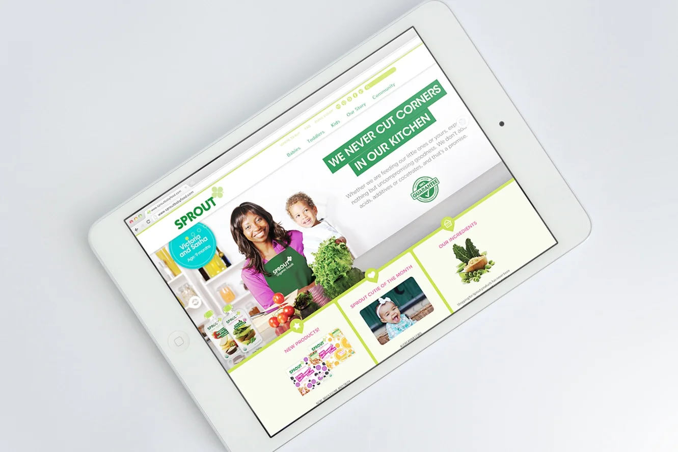
Sprout came to us looking to expand into print advertisements in popular parents magazines to increase their engagement and to differentiate their brand from other popular baby foods. We developed three design options for their consideration. As a second phase, we continued to push the idea of differentiating Sprout, and their brand focusing on the organic quality and the trustworthiness of their product.
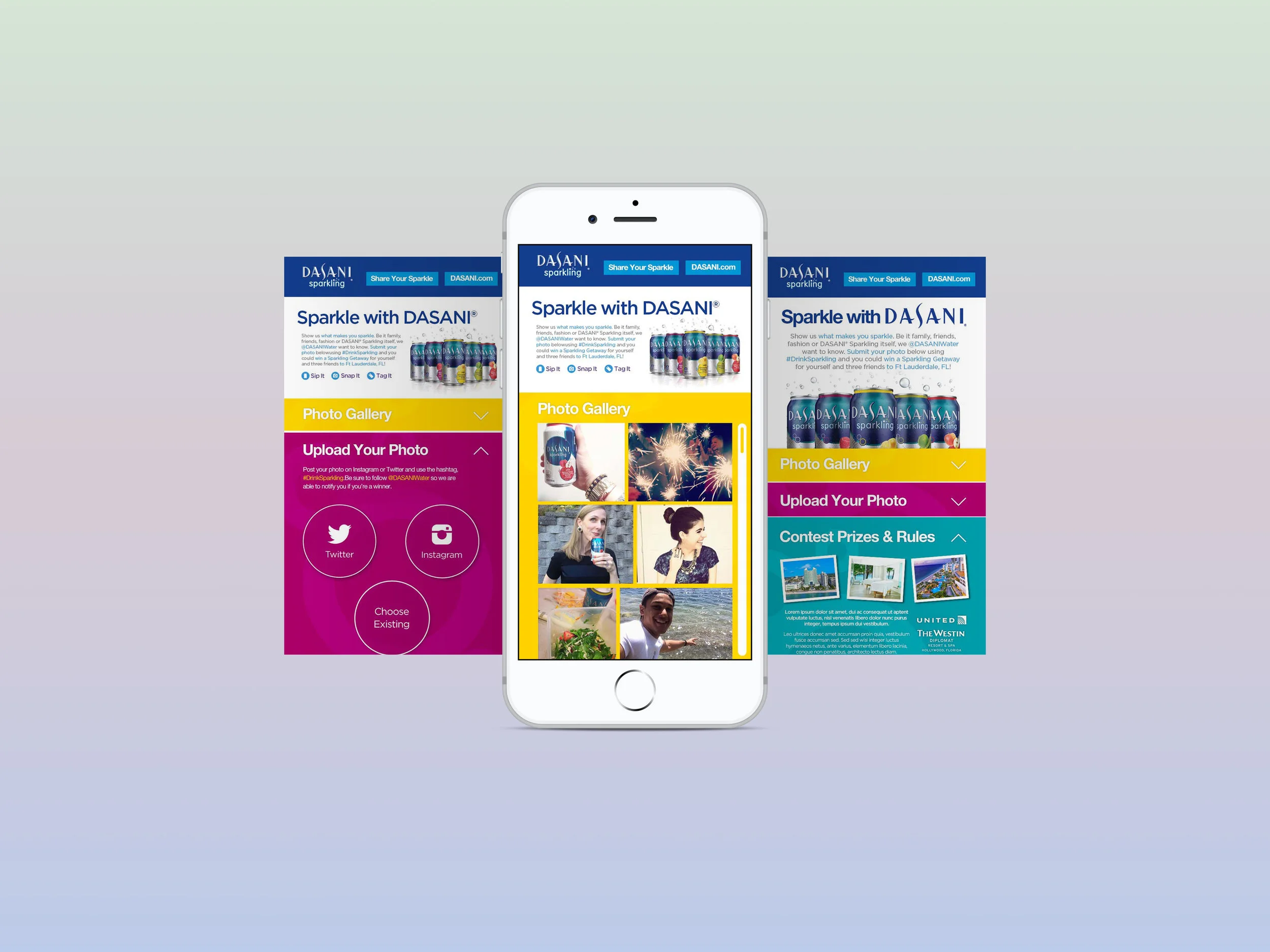
With the introduction DASANI® water's new flavored products, we were tasked with designing the brands' sweepstakes website and social posts. DASANI® Sparkling required a microsite where users could upload their images to enter for a chance to win an all-expense paid beach trip, while DASANI® DROPS™ consumers could enter on Facebook to win concert tickets, music equipment and free music downloads.
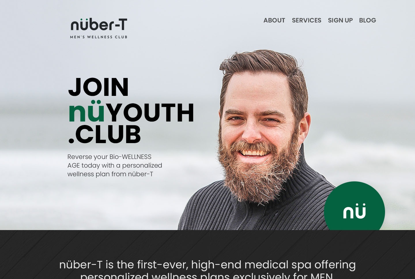
nüber-T as a rebranded, and newly developed men’s wellness program relaunched their brand’s initiatives in 2019. Looking to attract and entice men to join their exclusive nüYouth Club, the sought out a new website to educate and seek out memberships. Marketing to primarily older affluent gentlemen in their 40’s and up, their brand desired to help men reach their peak shape, and reversing the effects of aging through several wellness programs. Memberships also brought access to their exclusive clubhouse were these programs and other services to increase youthfulness in men were to be provided and nurtured. This is the one-page website developed to address nüber-T’s needs.
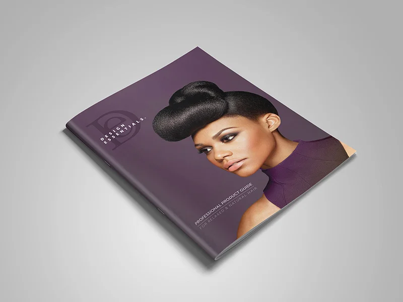
McBride Research Laboratories approached us for a refresh to the Design Essential printed product catalogues. Many of their customers including salon owners and stylists still desired a handheld, paperback booklet to view product listings — particularly for events and trade shows held in venues across the country.
Moving away from the standard grid or lineup to display products, our approach was to create a dynamic layout where the product appears to be falling or suspended in air. This direction allowed for the products to seamlessly flow into the layout of product descriptions and hair models.
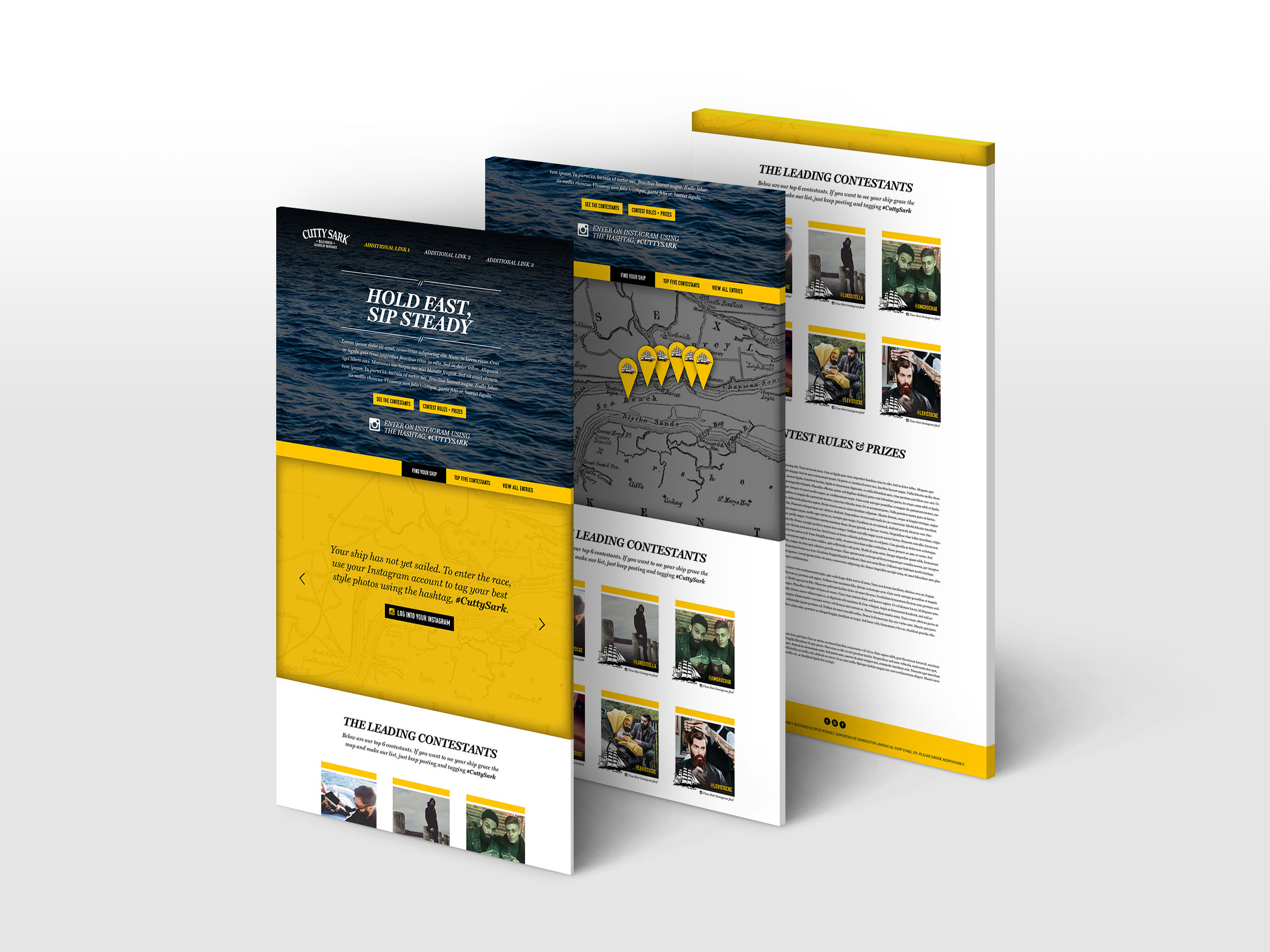
In a pitch to Cutty Sark Whiskey, we were asked to show our approach to their rebranding and online marketing efforts. Our solution was a microsite that would stand in as a place where online influencers and brand enthusiasts alike could come and submit user generated content that users would vote for resulting in several winners of these contests. The microsite was also a place to promote bar and product giveaways as well as private concerts.
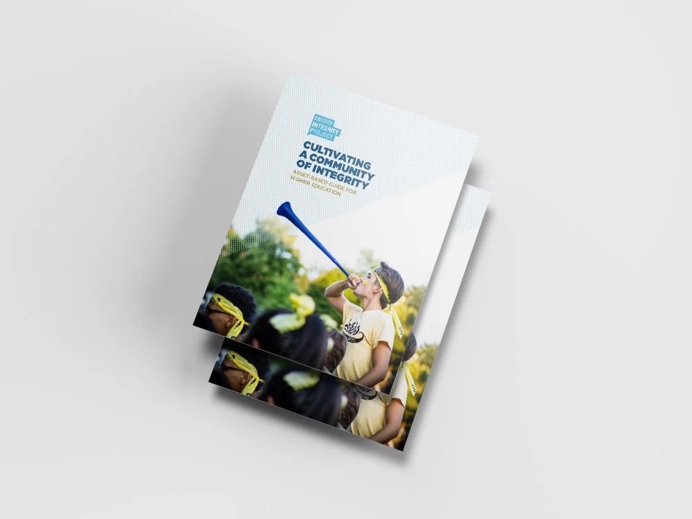
Emory University’s campus life department approached us to produce an on boarding and instructional booklet for staff and newcomers to their Emory Integrity Project. Providing content filled with case studies, student input and feedback as well as worksheets to reinforce these lessons and findings, we were tasked with developing a booklet that could combine each of these while amplifying the EIP brand. Using bold type and graphic shapes in patterns within a traditional book layout helped us achieve a direction that accomplished just this.